Over the past decade or so, both Canadian courts and the Canadian Trademarks Office have struggled with appropriate wording in a trademark application, where the mark consists of one or more colours as applied to an object. That having been said, both the courts and the Trademarks Office have agreed that colour, per se, is not registrable. In other words, the colour(s) must be limited to an object of a particular shape as shown in the trademark application.
In Canada, trademark applications are only published in black and white. Accordingly, it is necessary to describe the colours or else it is necessary to line the drawing in the application for colour. The Canadian Trademarks Regulations depict appropriate lining for a number of the most common colours. For example, vertical lines represent the colour red; solid, horizontal lines represent the colour blue, etc. However, many Canadian practitioners prefer to simply describe the colour, instead of lining for colour, since the lines may be confused for part of the design.
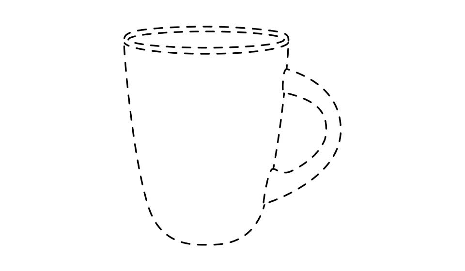
When a single colour is applied to the entire object shown, the periphery should be shown in dotted outline and the following description has been found to be acceptable:
The trademark consists of the colour orange applied to the whole of the visible surface of the particular mug as shown in the attached drawing.
If the word “particular” is not included in the description, the Trademarks Office is likely to object. A sample drawing might look like this:
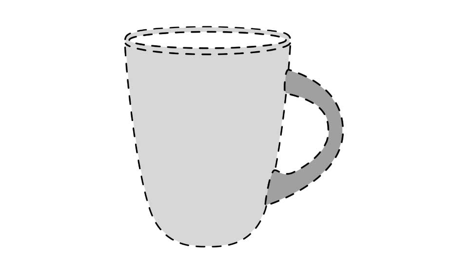
When two or more colours are applied to an object, a description along the following lines has been found to be acceptable:
The trademark consists of the colour orange as applied to the whole of the visible surface of the particular body of the mug shown in the attached drawing and the colour blue as applied to the whole of the visible surface of the particular handle shown in the drawing.
A sample drawing might look like this:
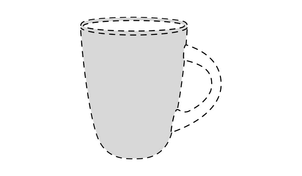
However, there has been no guidance in the case law or practice notices issued by the Trademarks Office as to how to claim colour as applied to only a portion of an object in a case where the applicant does not wish to limit the possible shapes (or locations) of the other features of the object. That having been said, recent experience suggests that a description along the following lines is likely to be acceptable:
The trademark consists of the colour orange applied to the whole of the visible surface of the particular body of the mug shown in the drawing. The particular shape, size and location of the handle shown in the drawing does not form part of the trademark.
A sample drawing might look like this:
While a description along these lines currently appears to be acceptable, Trademarks Office practice has been known to change without warning.
If you have any questions regarding the above, please do not hesitate to contact a member of our firm’s Trademarks group.
The preceding is intended as a timely update on Canadian intellectual property and technology law. The content is informational only and does not constitute legal or professional advice. To obtain such advice, please communicate with our offices directly.